Looking for a Product-Market Fit (PMF) is usually a challenging path with many obstacles. As a start-up, you also struggle with a limited budget and time to find the PMF as quickly as possible to move to the growth phase. Every penny counts, especially in recent times when it is so hard to get fundraising for new businesses. You have to make good decisions and test them quickly; it is also worth optimizing your different funnels as they can substantially extend the runway, which was an inspiration to write this article.
We were recently working with a product with a proper marketing budget that allowed us to validate different options for acquiring users. We tested all social platforms and different approaches, but the numbers were still low. We acquired many users, but only a few started using the app. It turned out that the problem wasn’t in the campaigns themselves but a bit later, as users who downloaded the app converted poorly to regular users.
At that time, we had a business goal to drastically increase the conversion, so we quickly reviewed the app. One thing that was really striking was the size and complexity of the onboarding process. We immediately got to work and decided to significantly improve the onboarding process in our client's application.
How to Improve Mobile App Onboarding?
Here, you have a ready-made recipe for approaching this issue in four steps based on our experience that increased the onboarding CR by 80%.
Step 1. Map the entire onboarding
When you have a good designer, you need to only ask about design with all steps in the onboarding put together one after another in the shape of a user flow. If you don’t have such a design, you have to go through the onboarding and take screenshots of each step.
It’s essential not to miss any screen or step that the user has to do, including native modals that appear from time to time to ask about some permissions. It is also a good practice to start from the first screen in the app and take a step or two back and add screenshots from the marketing campaigns and the store. This is all the same journey for the user, so we need to have an overview of the entire flow to understand the context and user problems.
Step 2. Start tracking the whole funnel and mark the drop-offs
Plenty of tools, like Posthog or Mixpanel, allow you to gather quantitative user data. If you don’t have one, you need to get one. Tracking all the steps, buttons, and actions the user can perform is essential. Sometimes, you can feel as if you exaggerate a bit and try to track too much, but remember that if you lack some events, it costs time to add them later, release a new version, and feed them with data. So, from my experience, I would strongly recommend adding more events and covering the entire flow.
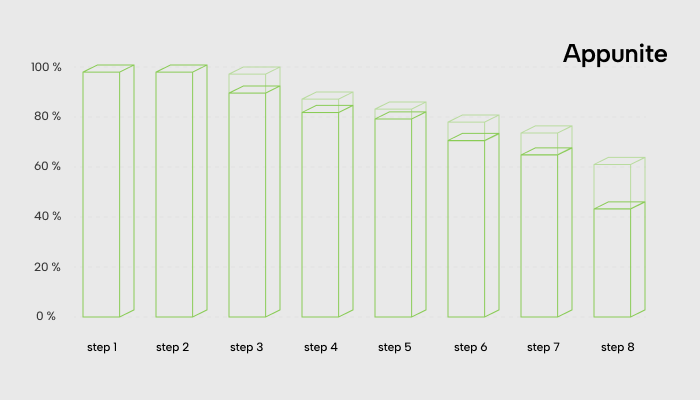
If you have all the needed events, you can quickly create a chart showing all the drop-offs. As you can see on the chart, a certain number of users always resign at every additional step of the funnel. However, some steps stand out. And this is where we should start focusing on. Remember, this is only quantitative data, so if you want to understand why, you need to ask your users.
In our case, the entire loss during the onboarding was almost 60%, which was huge. Over half of the acquired users, where almost everyone costs some certain amount of money, have never finished the onboarding and seen the main view of the app.

Step 3. Think about the goals, stay focused, and remove unnecessary steps
In our case, the onboarding process was really long. Using the previously prepared onboarding map; we asked ourselves what kind of goals we tried to achieve with each screen. It turned out that we tried to kill too many birds with one stone during the onboarding. We tried to:
- Introduce the product idea,
- Set up some features,
- Explain how the app works,
- Create an account.
We all agreed that this was too much. We discussed the most important thing we should lead to through the onboarding, and we decided that we should let our users feel the app's value as soon as possible. Fortunately, we had a clear vision of our 'aha' moment at that time and a clear goal of where we should lead our users. If you don’t know what your ‘aha’ moment is, just think about when the user, for the first time, feels and understands the value of using the app.
Then we just went through our onboarding, asking if that step was necessary regarding our ‘aha’ moment, or maybe we could move it later after the user understood how we would solve their problems.
Underneath every screen, we put colour labels: green, red, and yellow. It was clear to us that we needed to get rid of all the red ones, keep the green ones, and think about the yellow ones and how to address them better. They were important, but we could show them later after the onboarding. In our case, the best examples were setting up some features and explaining how the app works.

Step 4. Create assumptions, test, and enjoy results!
Based on our research, we created two hypotheses:
- By shortening the onboarding to fewer steps, we can reduce the drop-offs.
- By focusing on the ‘aha’ moment and removing all additional steps, we can keep users focused and lead directly to the value of the app, increasing the final conversion rate.
On the same day, we had a version of the new onboarding flow ready to test. We did quick interviews with users to confirm our assumptions about whether users were willing to finish the entire onboarding and if they still understood the app and were eager to use it.
Remember, when you change anything inside the onboarding, you shouldn’t measure only the conversion. It is also essential to look into retention. Some parts of the onboarding, even if they made some users drop off, could increase retention because the rest of the users better understand some critical value and give more time to the app. So you need to measure if the % of the user who passes the onboarding retains on the level that covers the % loss during the onboarding. The best way to check it is to run an A/B test and compare results.
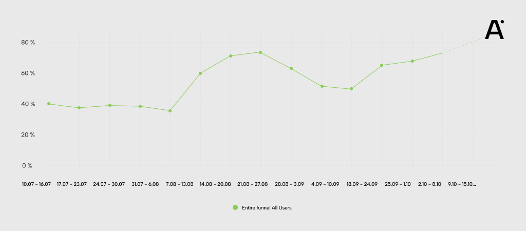
In the case described in this article, we managed to increase the conversion rate from 45% to 80%! Of course, not all of the users stayed in the app, but we had much higher chances of finding regular users from the much bigger sample, and by that, we saved a lot of money and extended the runway by the next few months!

Having a problem with conversion in your app?
Navigating the path to Product-Market Fit is more an art than a science, especially in a landscape where resources are lean and every decision weighs heavily. This article peeled back the layers of one crucial aspect – onboarding optimization – and illuminated how a focused approach here can be a game changer.
Remember, the key is understanding your users' journey, identifying and removing unnecessary steps, and continuously testing and refining the process to align closely with your users' needs. Think of it as tuning an instrument; every tweak in the onboarding process, every refinement based on user feedback, brings you closer to that harmonious balance where user needs and your product’s value proposition align perfectly. Velocity is key.
Contact us if you're looking for more tailored advice or want to discuss specific challenges with your product. Our team is always ready to help you navigate the complexities of building a product that creates an exceptional user experience. Let's work together to turn your vision into a thriving reality.
