


First platform to offer direct-to-consumer imports of luxury goods from Italy
The Client
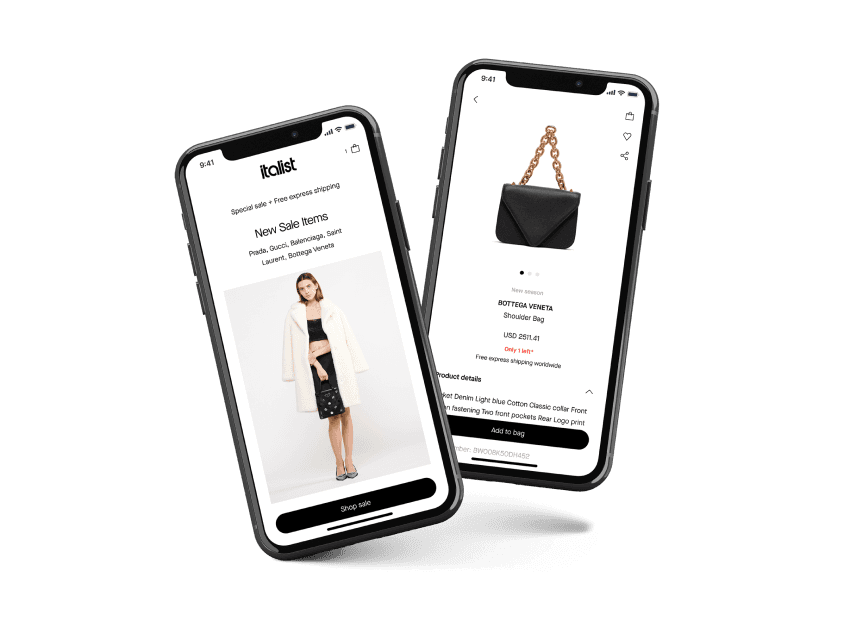
Italist is a popular luxury e-commerce platform, with over 1500 brands. They are partnered with many high-end boutiques, thanks to which they offer luxury goods for up to 40% less than other websites. Launched in 2014, they were the first platform to offer direct-to-consumer imports of luxury goods exclusively from Italy. The company is based in Los Angeles, Milan and Amsterdam.

Challenges & Solutions
Releasing a fully stable application immediately
We needed to release a full-fledged project right away (i.e., without an MVP phase) and ensure that our application was fully stable from day 1. The app’s luxury buyers had to experience a flawless service, so we had to pay maximum attention to every detail, both design and functionality.
Global availability
Having a global user base meant launching the app globally. Technically speaking, this meant handling full internationalization as part of the initial launch. This was not particularly onerous, as we routinely consider internationalization in all our projects in any case.
Maintaining the user base
We had to convert web users to app users. This meant that the app user experience had to entice them to use it. It was critical to ensure that the first impression would be positive and users would return to the mobile app for future purchases.
Thorough analytics
The goal was to increase the conversion rate, so we conducted extensive analysis using the right tools integrated into the app. We wanted to be able to track results and draw conclusions quickly. The goal was to improve the user journey, so future marketing strategies can be implemented using the collected data.
Taking things into our own hands
Teams were located all over the world (USA, Italy, Netherlands, Poland), so there were multiple time zones involved. To deal with this efficiently, we started taking on more responsibilities and making more tactical decisions about the project. Cementing client trust with every sprint, our relative independence reduced development bottlenecks and directly led to an initial successful product launch.
Quality Assurance
Thanks to the high quality of our standard internal processes, we managed to release every app version with no significant bugs or errors. As noted, quality was one of our architectural drivers due to the luxury market the app is targeting.
Continuous communication
We started the design phase by creating user flows in close collaboration with the client. In parallel with refining all the requirements, which themselves were quite complex, we began delivering more advanced wireframes and the final UI for each specific part of the app. Constant feedback and close attention allowed for on-time acceptance, followed by the development phase.
Using the right framework
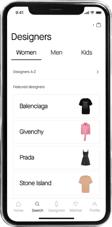
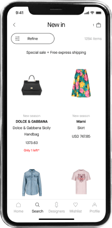
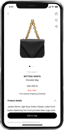
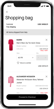
Flutter has made it much easier to maintain the app for iOS and Android, along with lightening the load of work needed for new feature adds (cross platform - one code base for both systems). The fast and easy to use UI widgets allowed us to quickly reproduce the look of the existing site, so that users wouldn't feel a difference swapping the web for the mobile app.
Adapting to changes
During the development phase, we were asked to change the whole design system, which was delivered by an external agency working on the client’s side. Fortunately, modern design practices demonstrate that redesigning doesn’t have to be scary! Our design team paid close attention to the details from the beginning and worked on the advanced components. Merging two styles of design into one was very quick and efficient, thanks to which, the design team had a new version of the app after just one working week.

Results
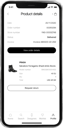
Luxury app for both systems (iOS and Android)
Long-lasting partnership with the client - we are still developing the app (adding new features, improving UX, writing tests etc.)
Higher conversion rate than for the web platform